Visualizing VCL
Posted on 2015-11-16
I was preparing to upgrade a customer, and ran across a semi-extensive VCL setup. It quickly became a bit hard to get a decent overview of what was going on.
The actual VCL is fairly simple.
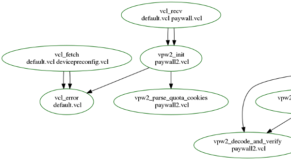
To deal with this, I ended up hacking together a tiny awk/shell script to generate a dot graph of how things were glued together. You can find the script at http://kly.no/code/script/vcl-visualizer.sh .
The output is somewhat ugly, but useful.

(Click for full version)
Of note:
- This is so far Varnish 3.0-ish, mainly because of the error-syntax. (So it'll work for 4.x, just without vcl_error-tracking)
- Green borders: Found the reference and everything is OK.
- Black border: The sub was referenced, but not found in any VCL file.
- Red border: The sub was found, but never referenced (doesn't count for subroutines beginning with vcl_, e.g. vcl_recv, etc)
No idea if it's of interest to anyone but me, but I found it useful.